Oil & Well
SERVICES: BRAND STRATEGY, VISUAL IDENTITY DESIGN, PACKAGING DESIGN, WEB DESIGN
Oil & Well started in a small Ottawa apartment, where founder Deinye was searching for something simple: a body oil that actually worked for her dry skin without feeling heavy or synthetic.
After months of experimenting in her kitchen, blending natural oils and fragrant notes she loved, she created something that felt right, lightweight, nourishing, and genuinely calming to use.
What began as a personal solution became a small batch brand rooted in the belief that body care should feel good, smell beautiful, and bring a sense of ease to your everyday.
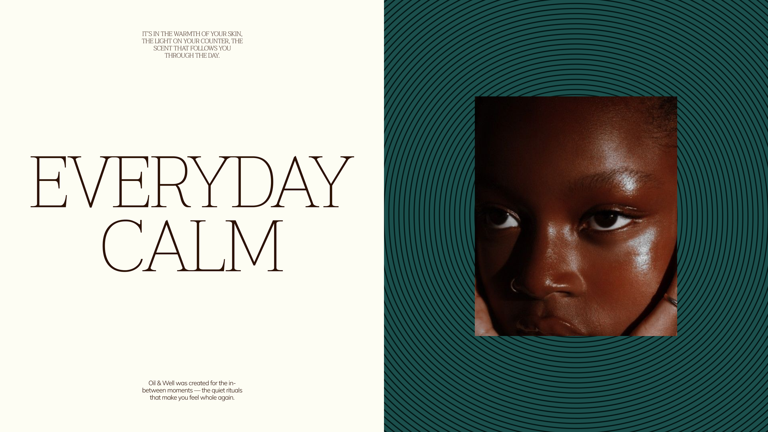
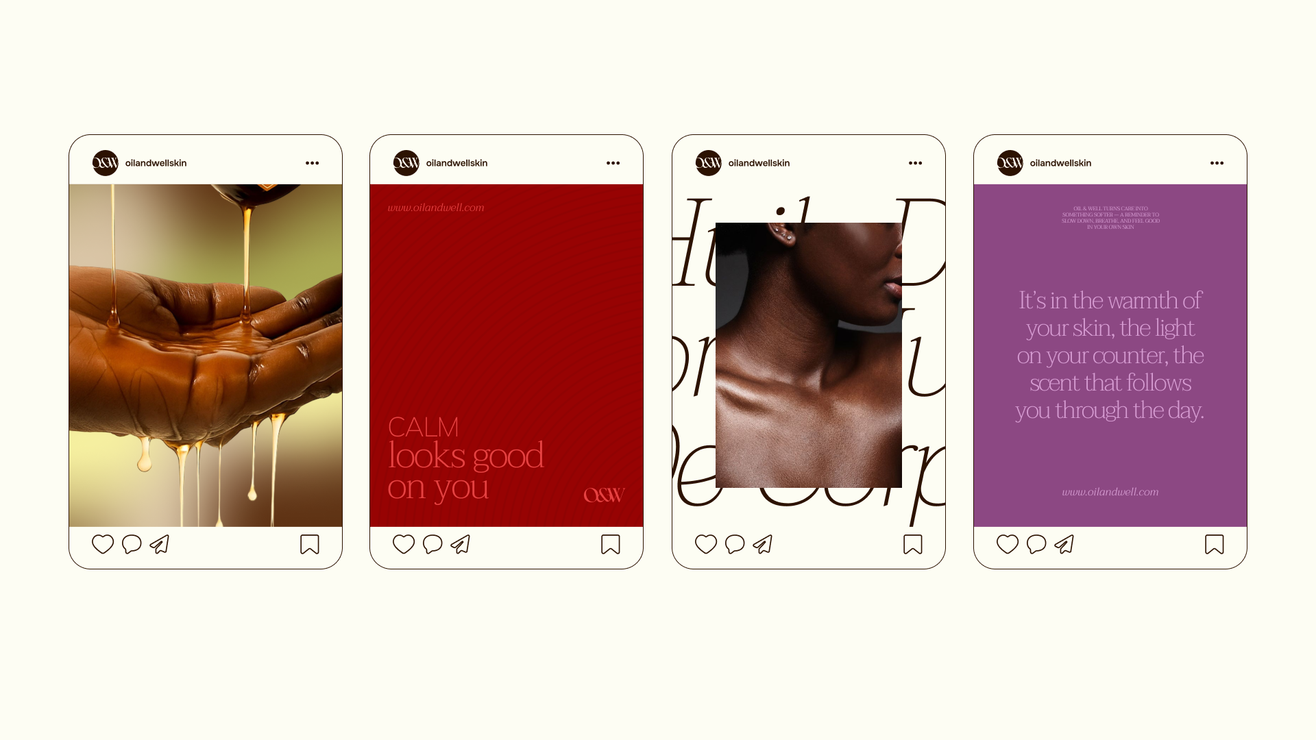
We worked with Oil & Well to define the brand's strategic and creative direction, landing on Everyday Calm as the brand platform, the idea that Oil & Well delivers a luxury spa experience without the occasion required to justify it. We ultimately delivered a comprehensive visual identity system, packaging, and an e-commerce website design.
Logo & Visual Identity
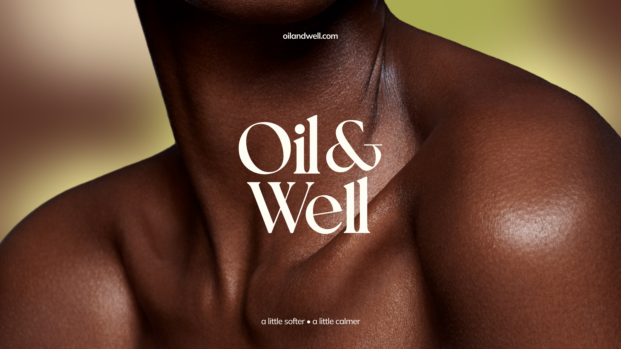
The visual identity is anchored in ritual, warmth, and serenity.
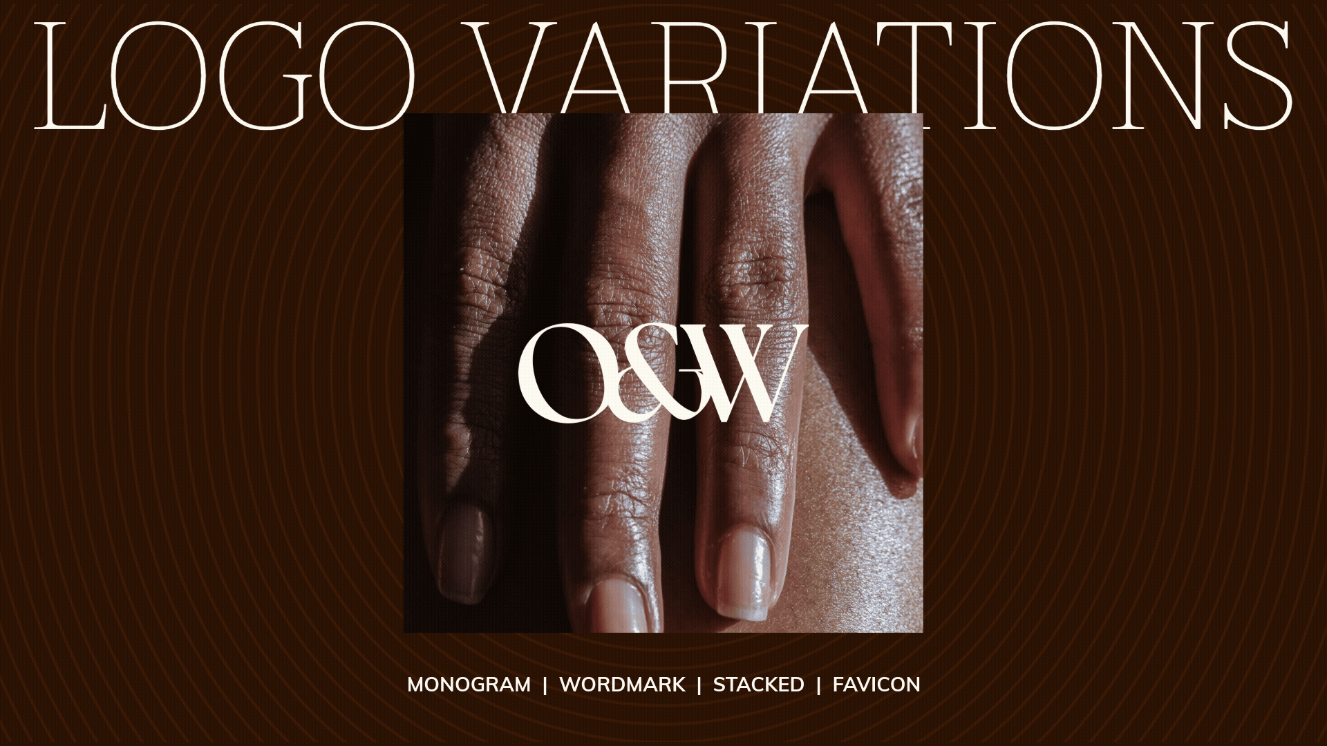
The logo suite consists of a custom serif wordmark and monogram, each available in stacked and horizontal arrangements, with a distinct typeface that sets it apart from the brand's two typefaces, a modern slab serif and a minimal sans serif.
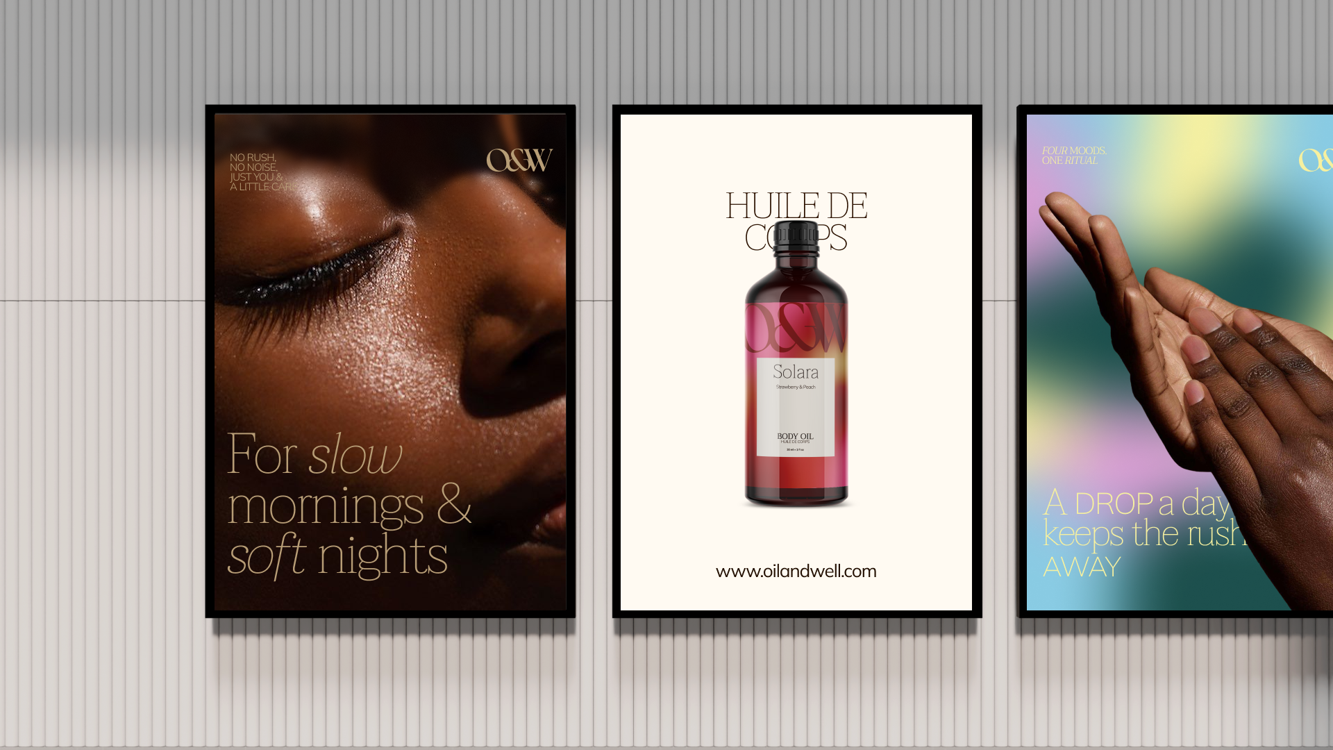
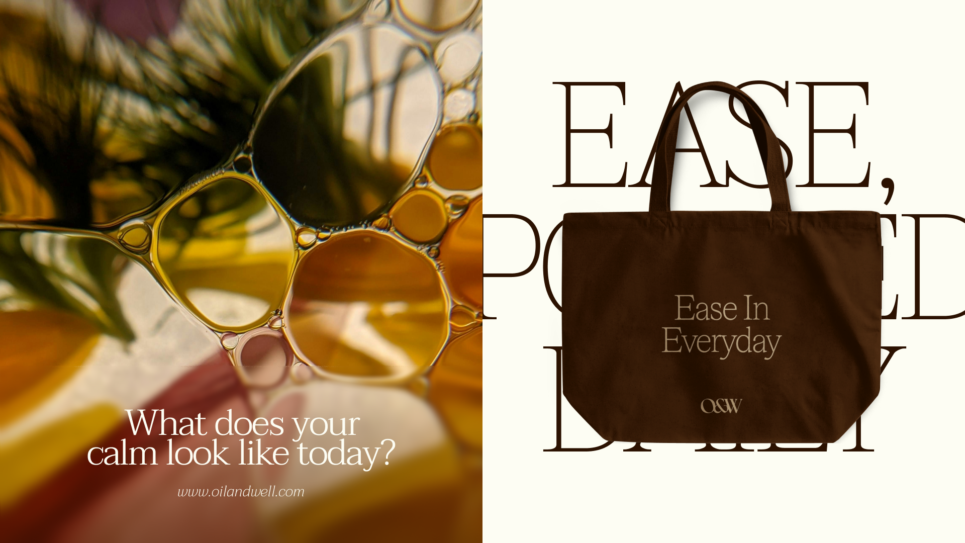
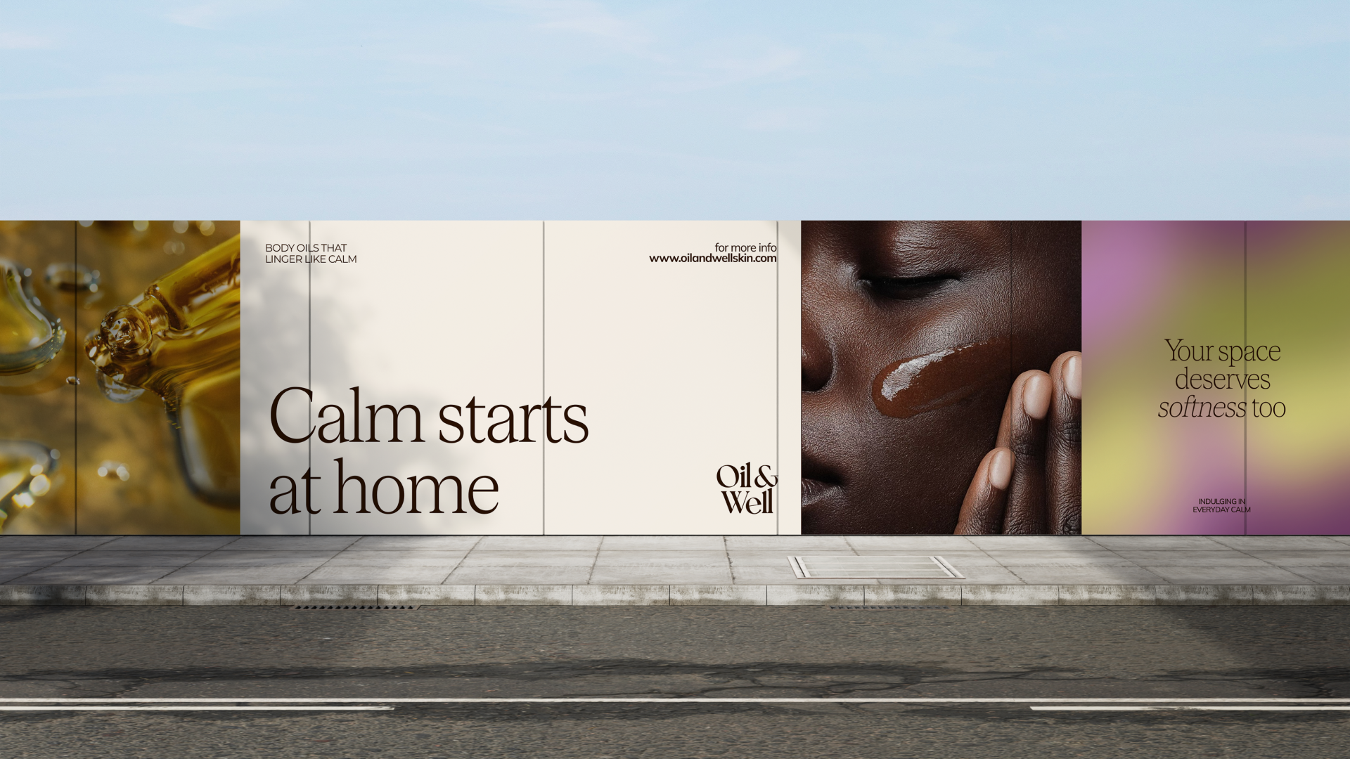
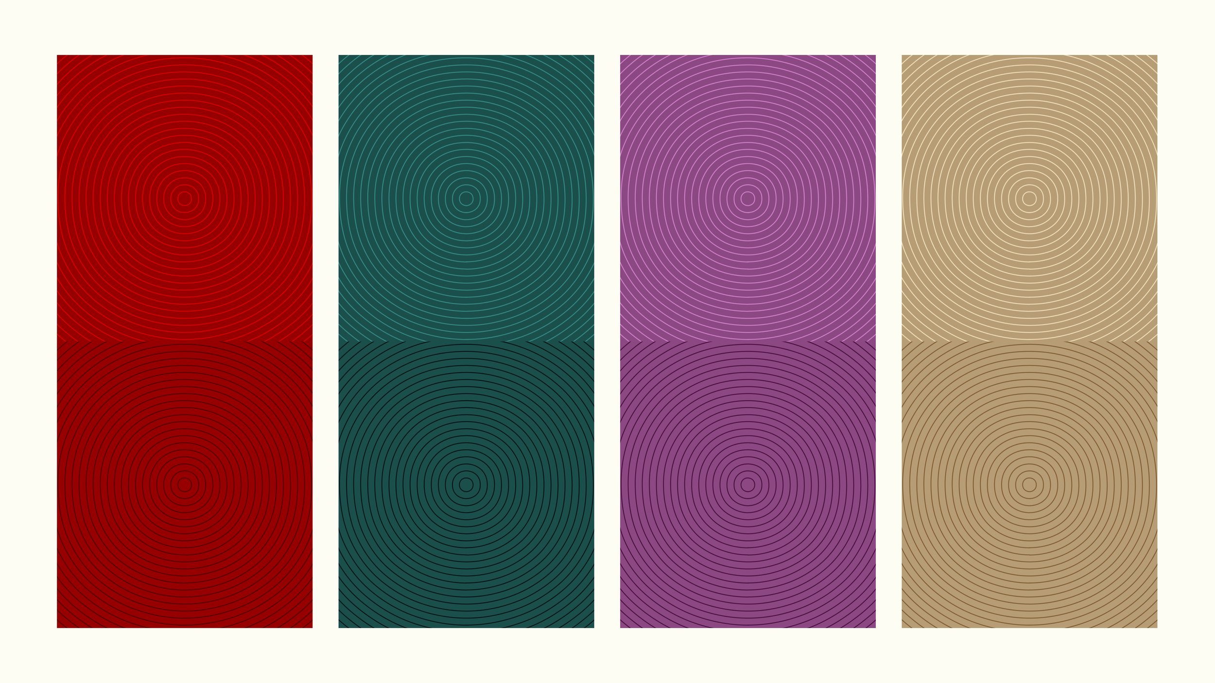
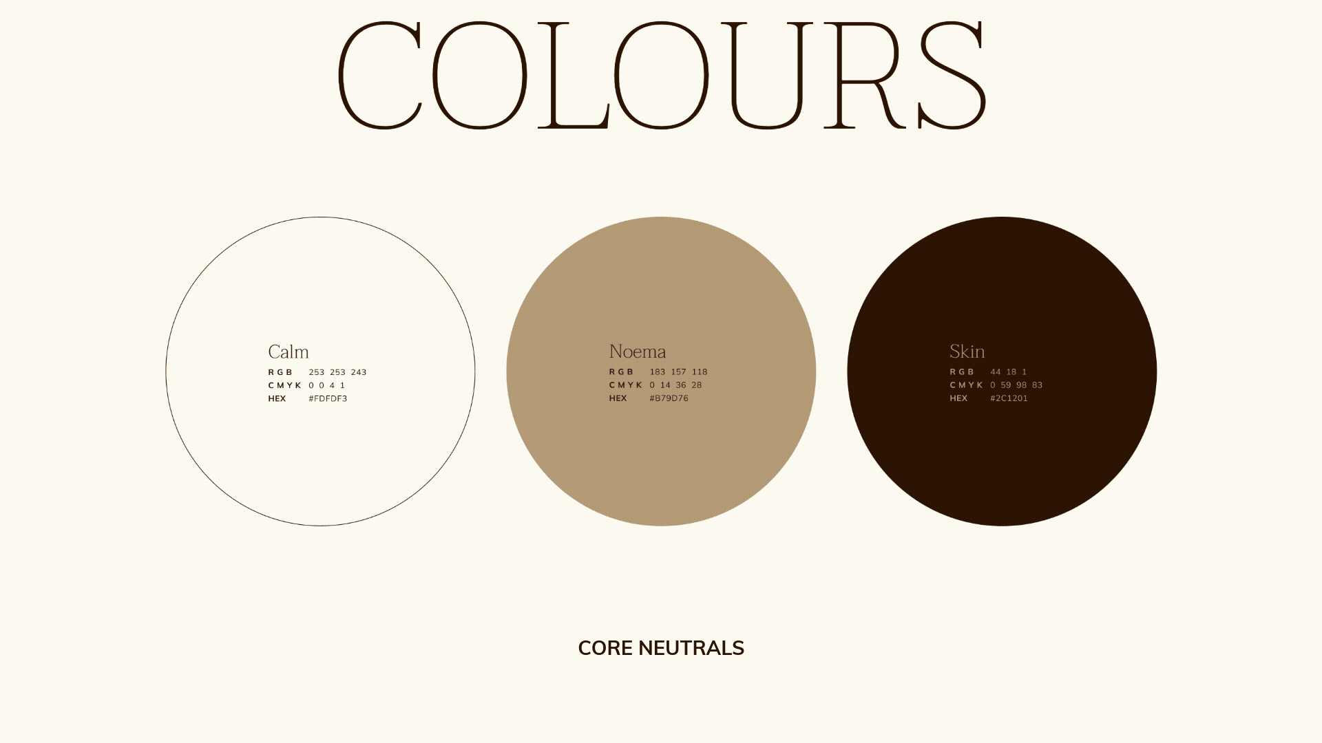
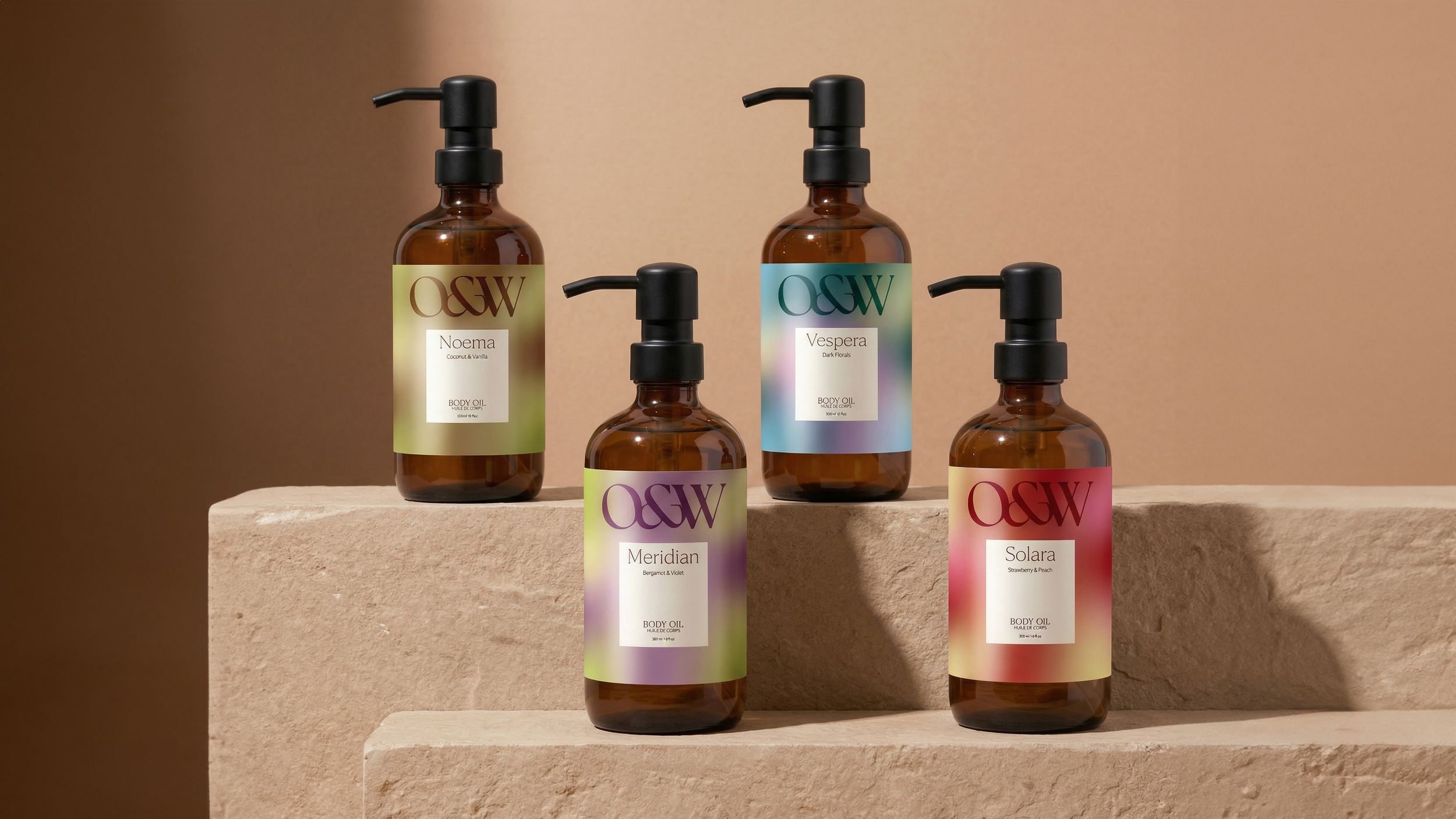
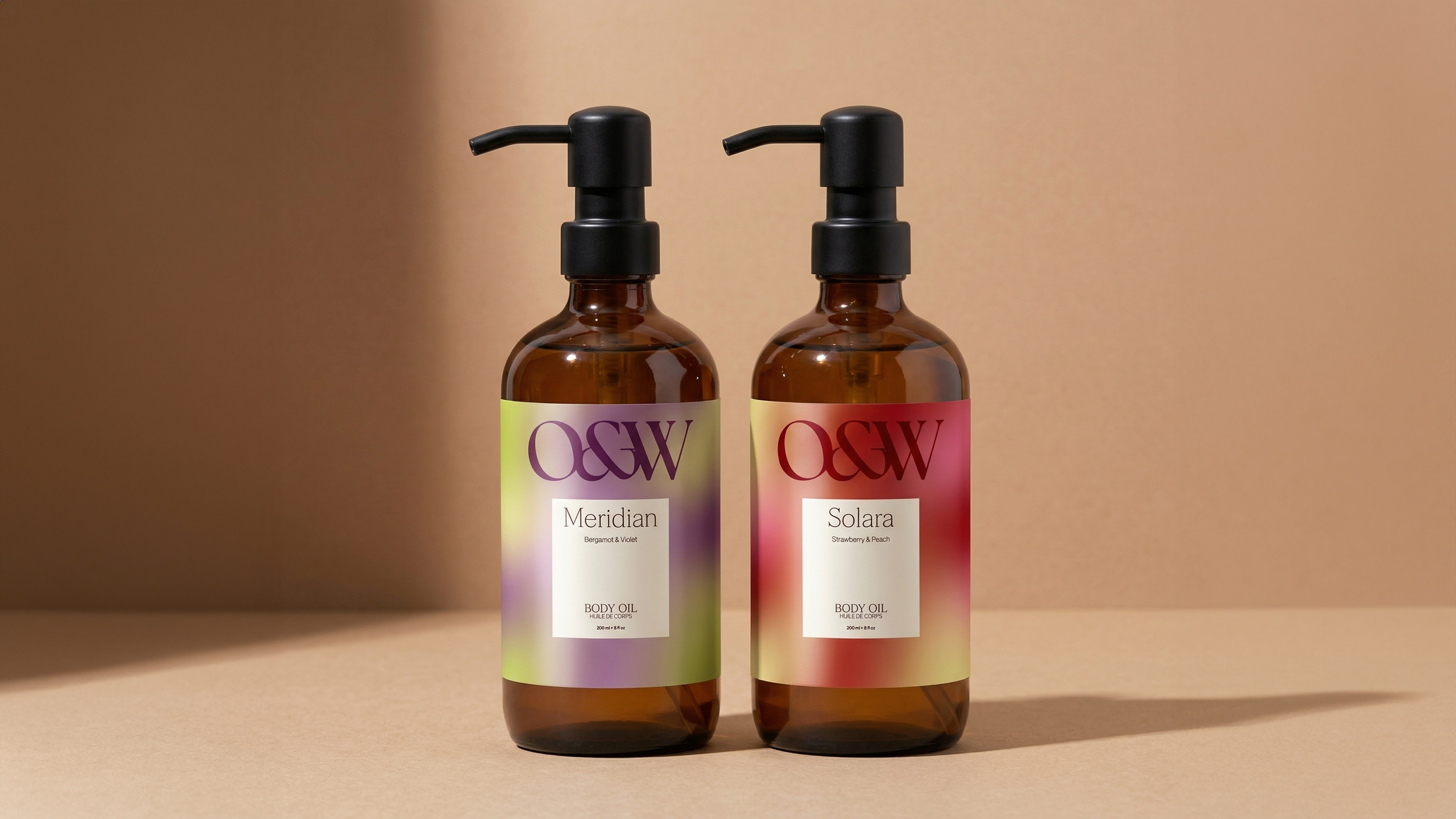
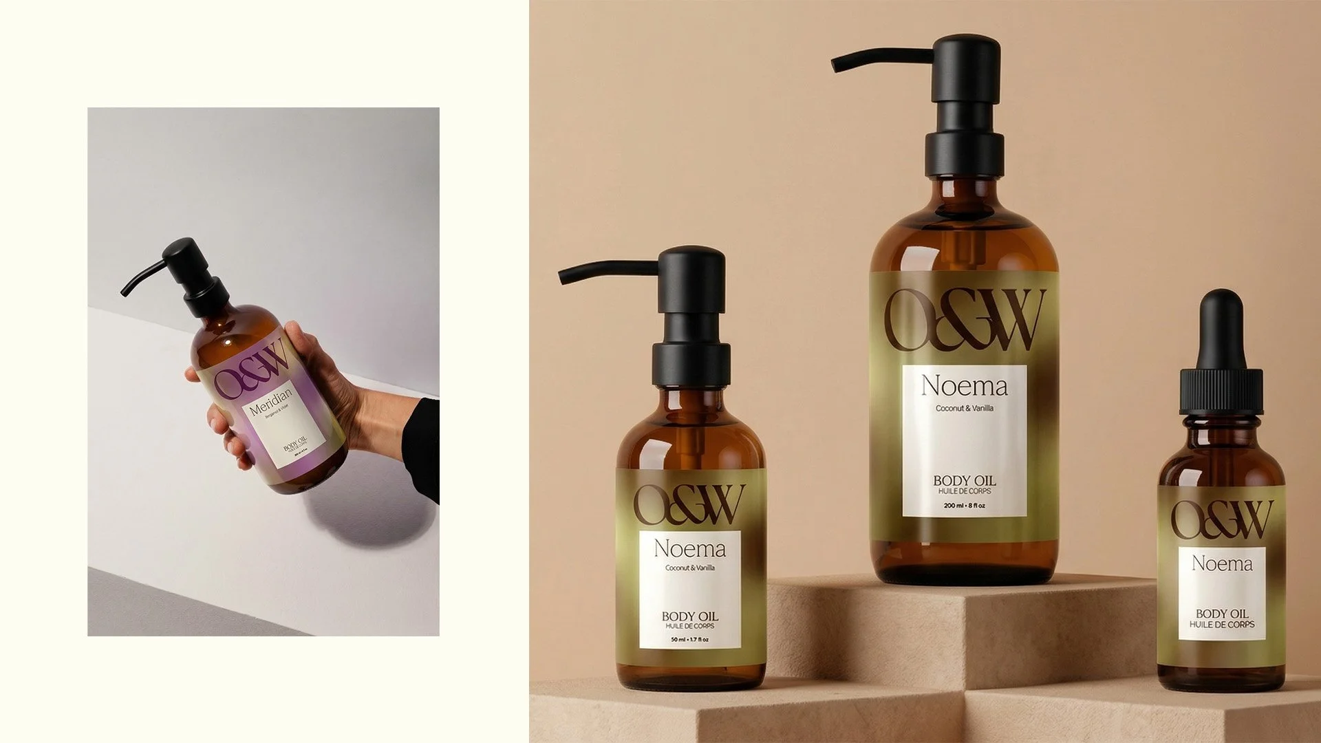
The colour system layers neutrals inspired by oil and skin tones as a foundation, with deep muted tones and soft pastels drawn from the fragrance range to add depth where needed.
Rounding out the identity are a monochrome ripple pattern inspired by the movement of oil, bespoke gradients for each fragrance, and distinctive photography treatments that carry the brand's mood across every surface.
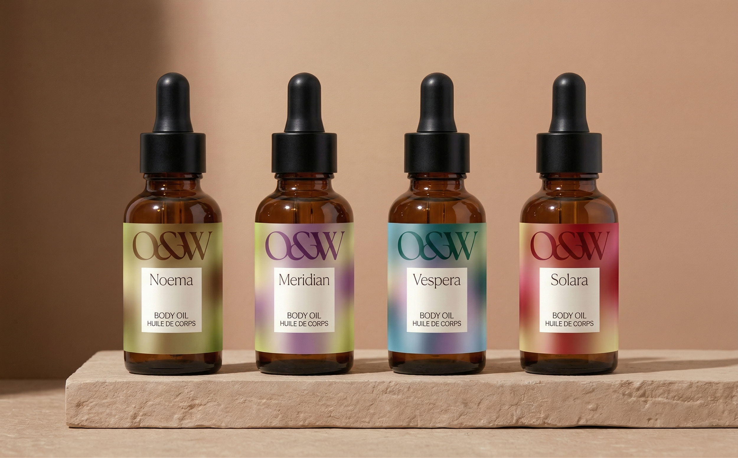
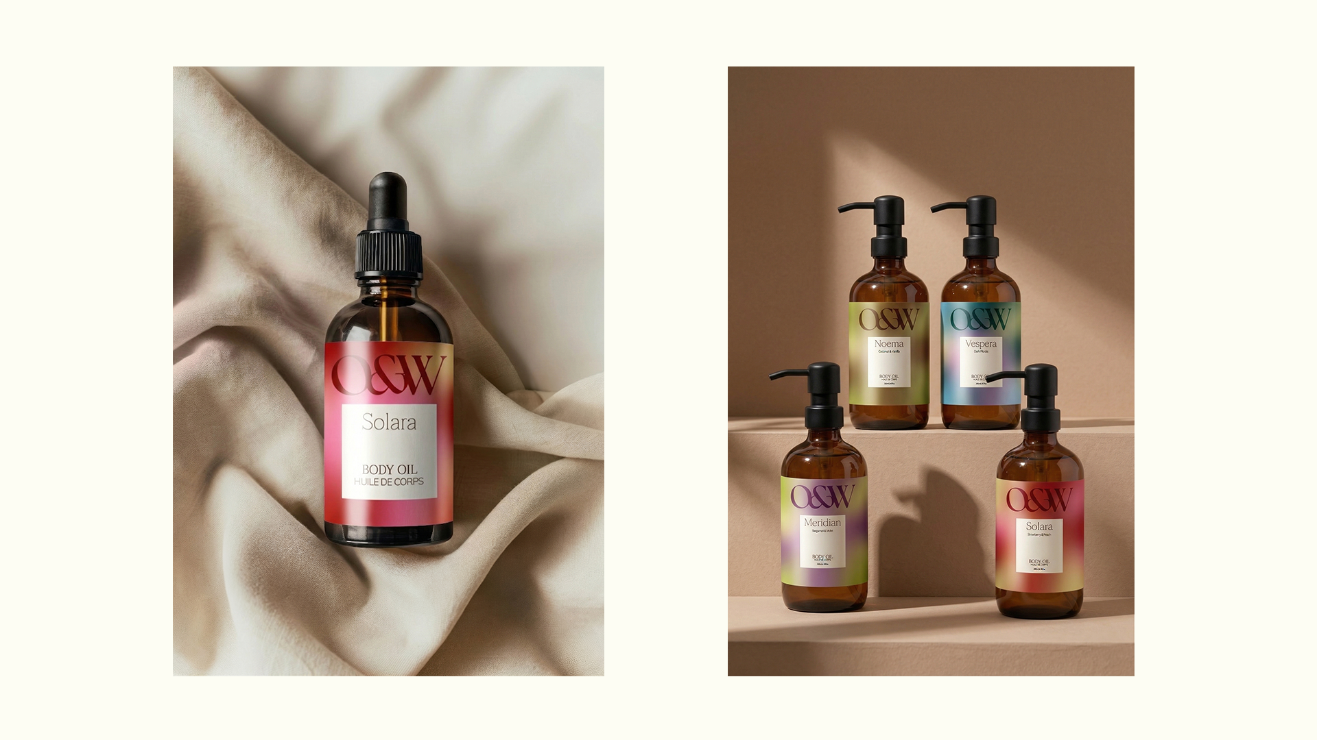
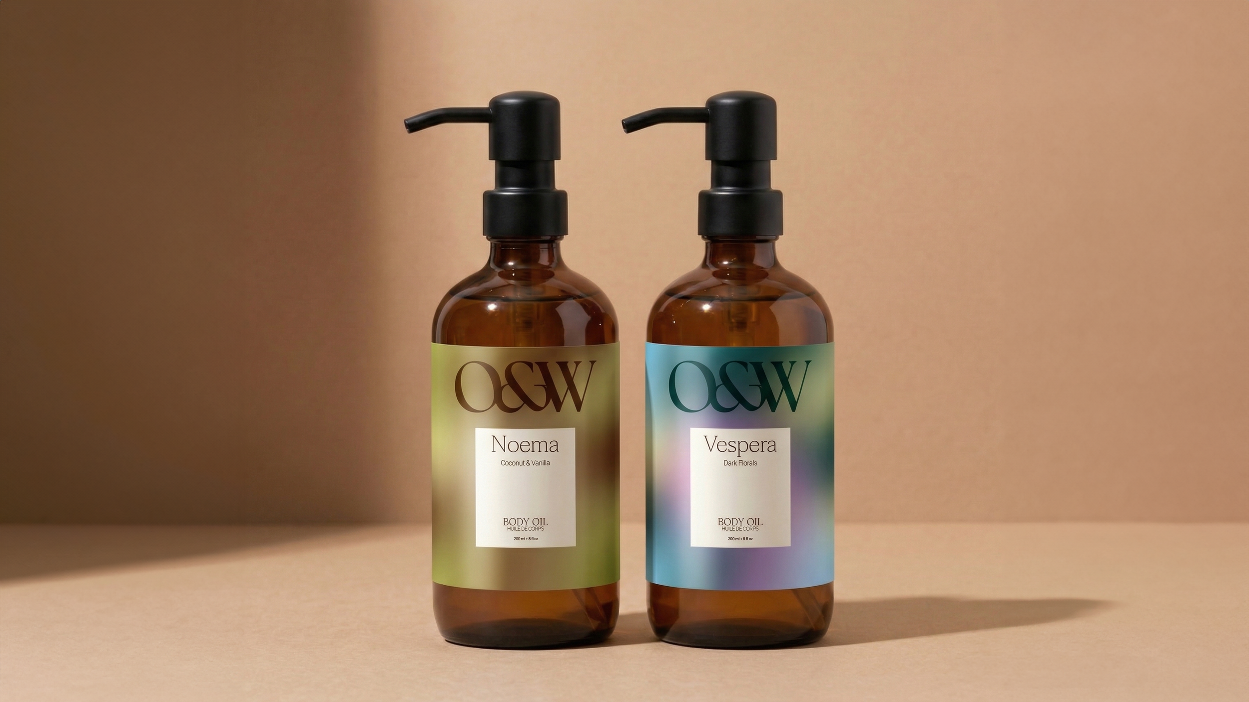
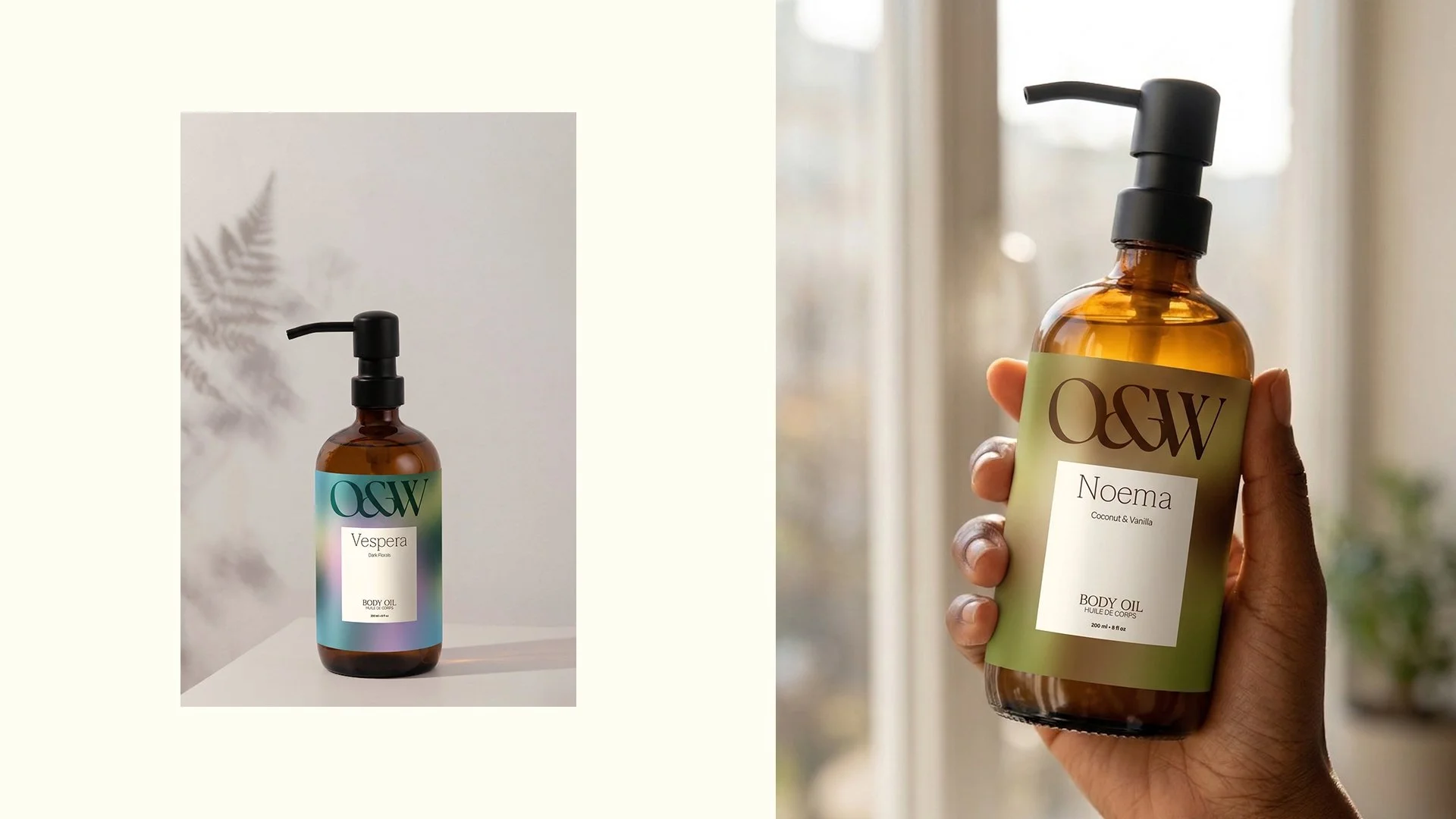
Product Naming & Packaging
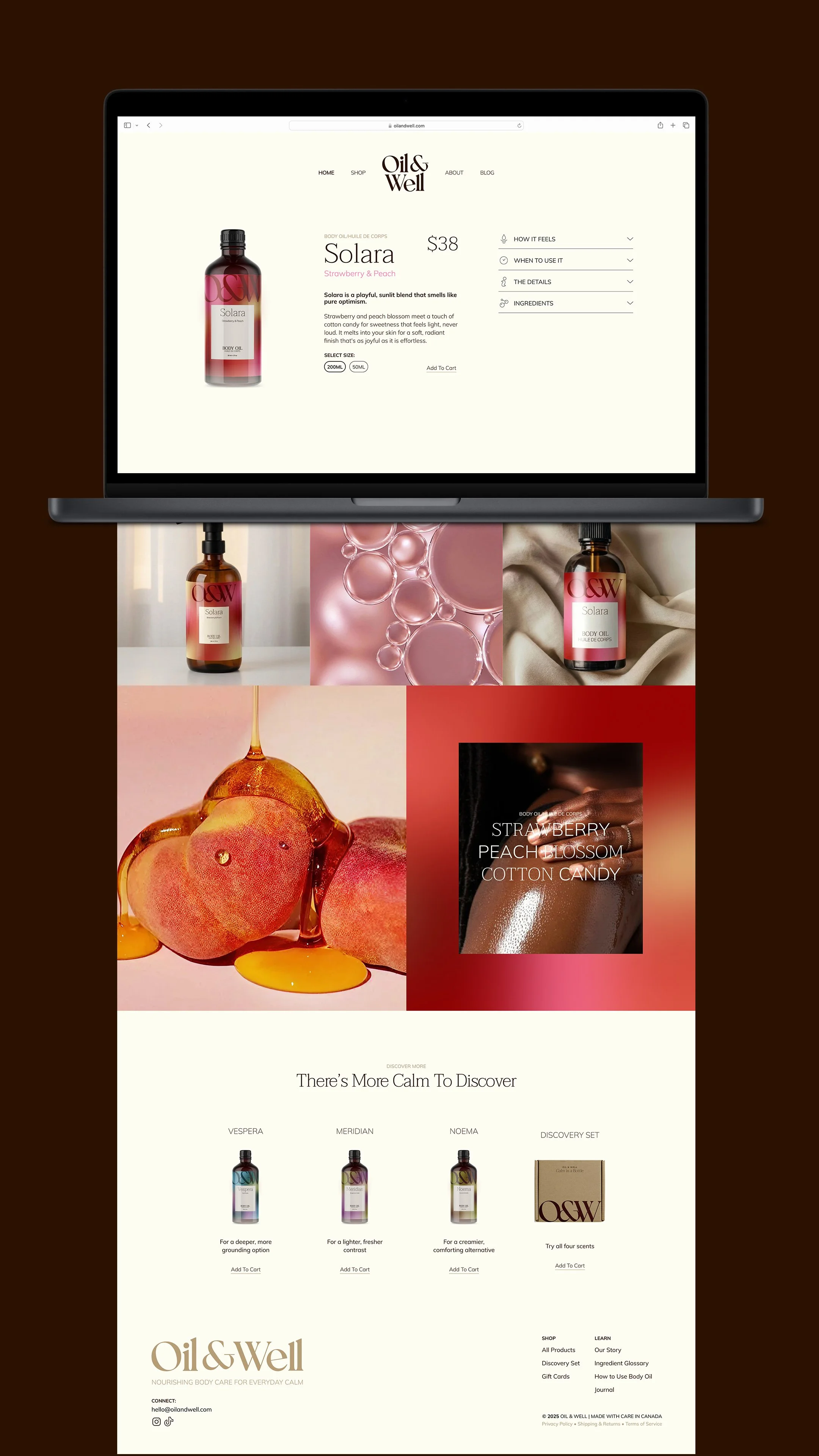
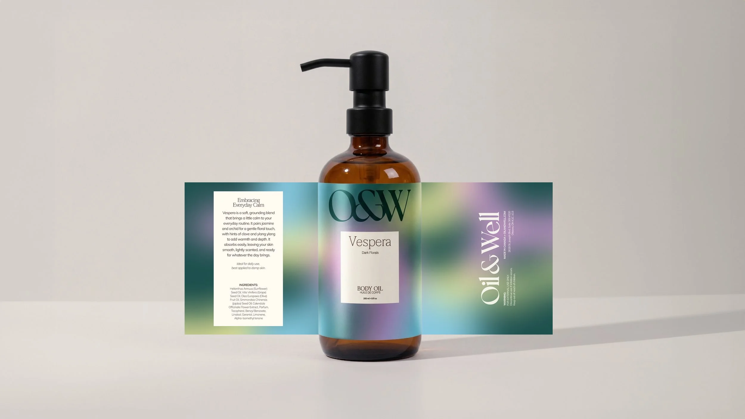
When Oil & Well came to us, their four core fragrances had an inconsistent naming convention that ranged from descriptive to evocative with no clear throughline. One name, Vespera, felt like the right blueprint: single-word, feeling-forward, and memorable. We built the new system around it, so every fragrance now carries a name inspired by the emotion it evokes rather than its ingredients.
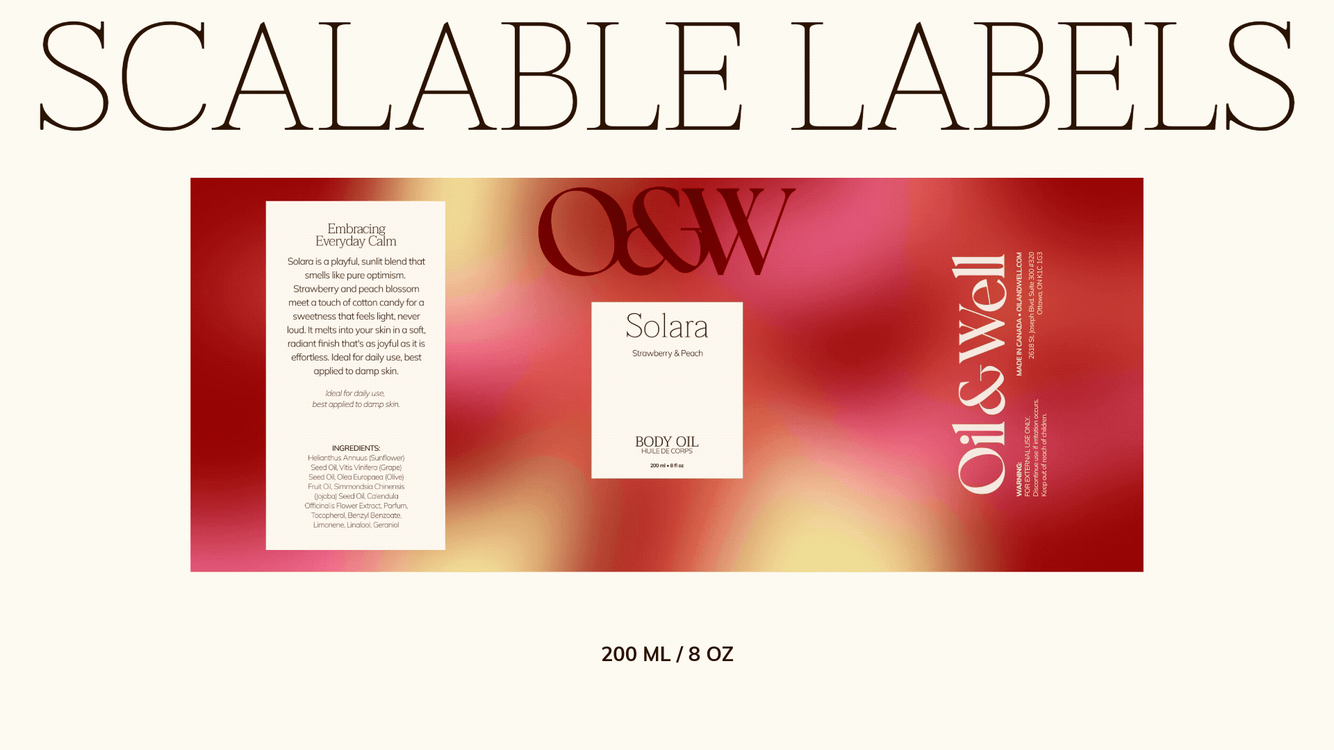
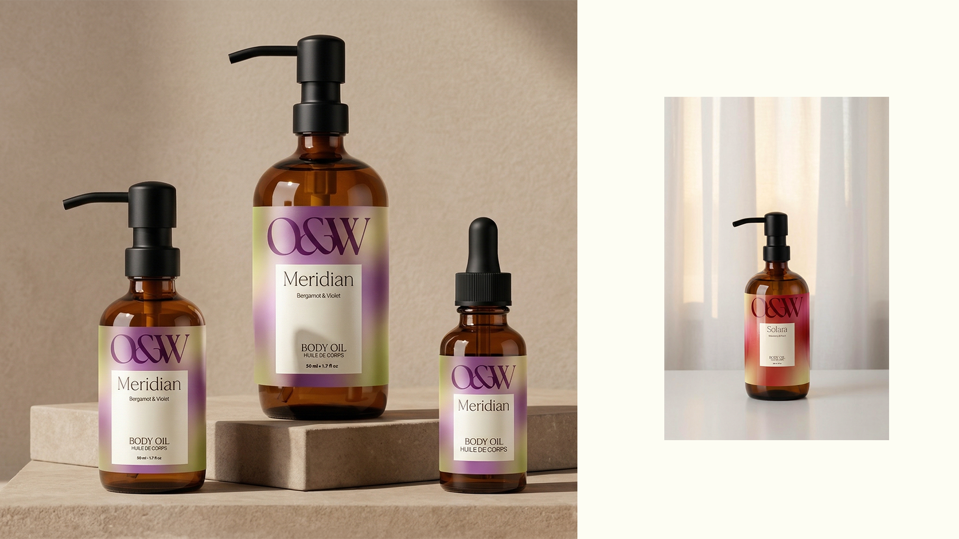
That same logic extended into the packaging. Each fragrance has its own distinct colour palette and gradient, forming the visual foundation of the label system. From there, we designed with strict rules around spacing, alignment, and formatting to keep every label clear and readable at any size. As the label scales down for smaller volumes, the information simplifies accordingly, so the packaging always feels intentional rather than crowded.
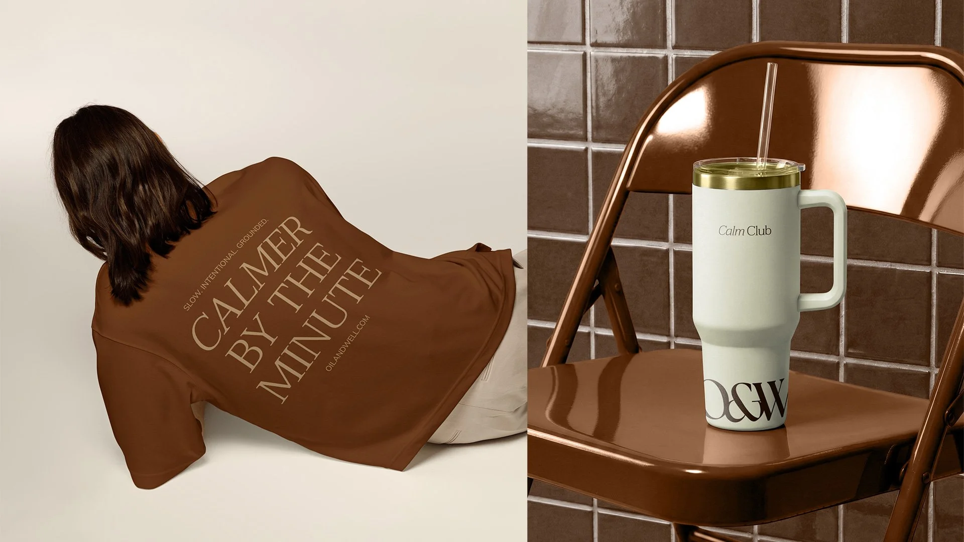
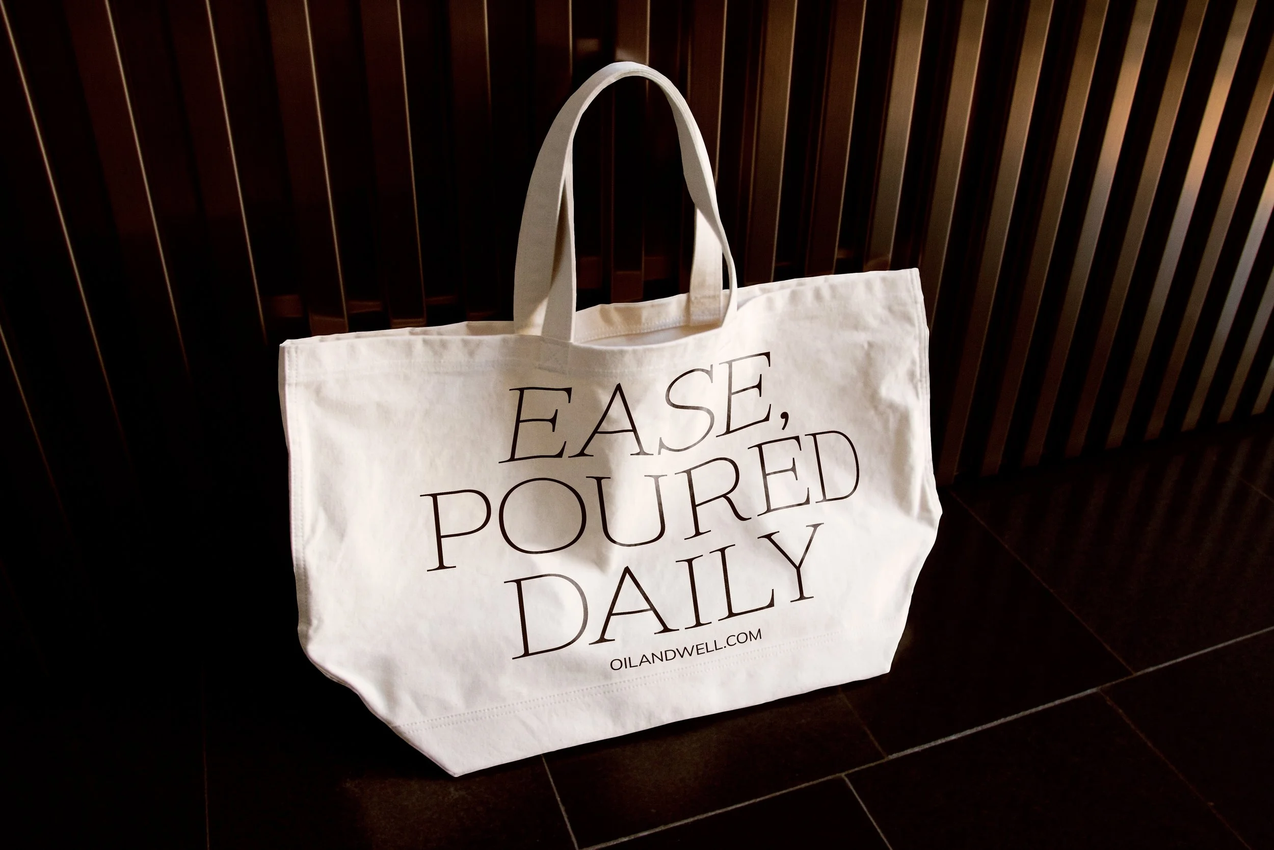
From social media templates to out-of-home activations, e-commerce, and brand merch, Oil & Well now boasts a cohesive experience at every brand touchpoint.